We draw parallels Emphasising the differences Between each other Better than or worse than Underlining our egos
Draw only one line With all your heart Empty of comparison Then you will be Unparalleled
Dusk, December 16th 2025
Fae Morgana lifts her veil O’er the moor and river And the sunset’s golden crown Bejewelled with starlings, glitters Above the western hill Where the staff was planted As dusk creeps across the lawn And blackbirds call and answer
Notes: The first poem was written as a reminder to myself that, in my creative practices, I need to be true to myself even if it brings in negative criticisms. It occurred to me it can also apply more widely to our humanity and our interactions with others.
Fae Morgana: Fairy Queen of Avalon. Her veil is the mist rising from the local Glastonbury landscape. The planted staff in the poem refers to the local legend of Joseph of Arimathea and the Glastonbury Thorn.
The sum of this year’s sunshine laid down in the weight of hedges A luxury of space for art from when the summer was younger The push-rich jump to the front of the queue for a penny treat Newly-minted linen and leather bound Shades throwing shade
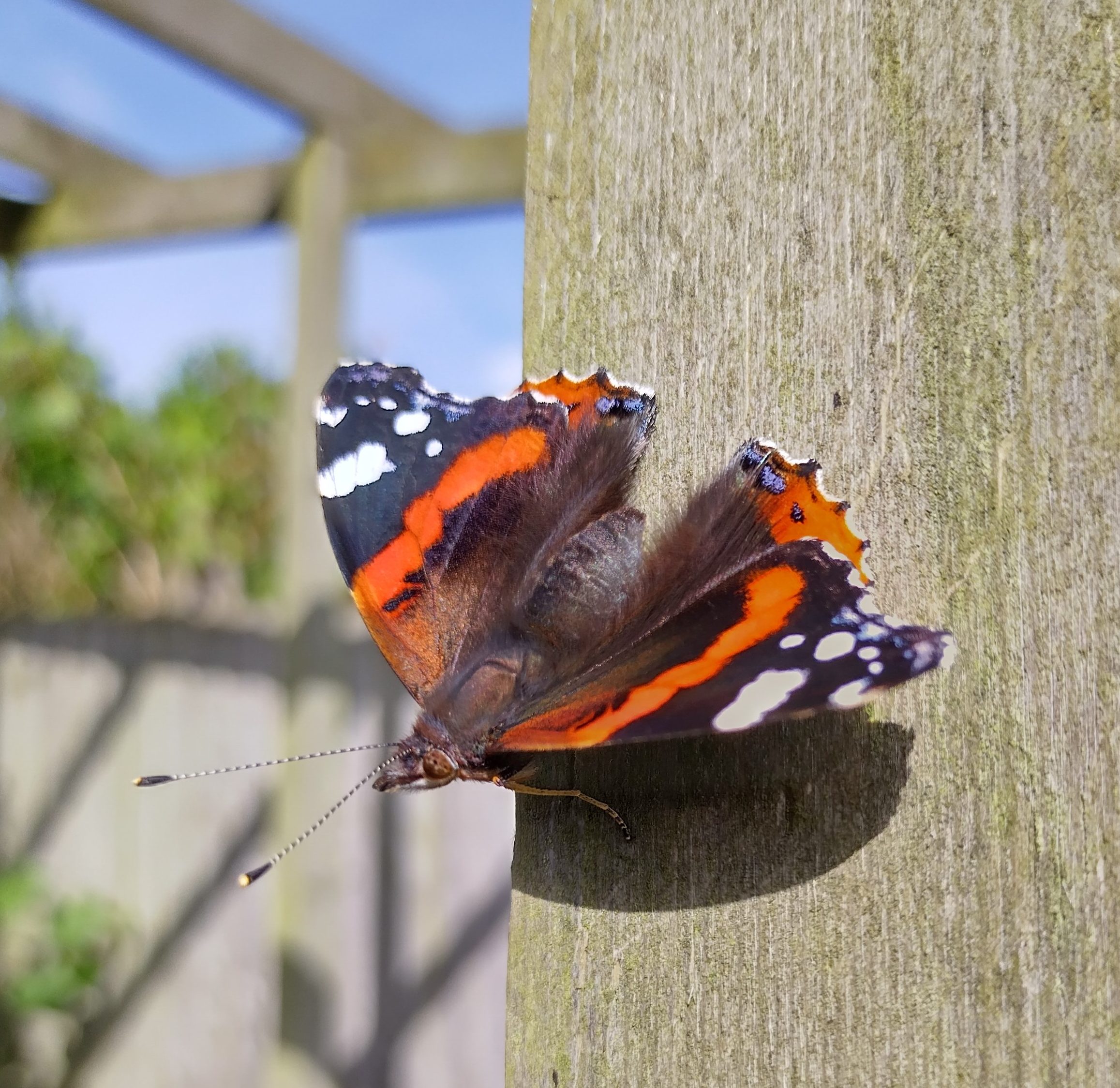
White butterflies over a palette of green while the whelk watches At the end of the garden, listening to the ailing ladies All aches under endless, faultless blue skies The hatted salmon lattes, breakfast eaten at the gallery
Inside the sculptures are stopped The frozen grin of a deer skull Dead tree Old wheels unspun
Where did you dance when the summer was younger?
Notes
I wrote this poem in 2025, then mislaid it and then stumbled across it today. The feeling of summer heat seems pertinent this year, with heatwave after heatwave and having to retreat indoors to escape the sun.
Whelk: Marine mollusc with a spiral shell (archaic: a boil) Welkin:The sky
I ‘ve based this linocut on poppy seedheads from my garden to create a graphic water-based acrylic print, framed in pretty free standing wooden frame. Great for giving your interior decor a dash of summer!
This linocut is based on an object I saw in a museum, an ancient toy cat, perhaps a leopard or lion or a barely domesticated mouser! I loved its simplicity of form and its essence of wildness, still vivid after a few thousand years. This linocut cat lives in the imagination so has only the bare minimum of detail, hunting its prey on an imaginary ancient riverbank.
Water-based ink on paper, from a limited edition of 17 Black on orange: print 5 of 17 Orange on blue: print 12 of 17
There is a fantastic selection of original postcards, created by artists all over the world in support of this year’s charity supporting people with Alzheimer’s, including this watercolour of mine.
Card Motifs : cake and candles / cacti flower / arrow ! heart / vases and leaf
These handy packs of four handmade greeting cards feature art collages made from paper I’ve hand-printed with a silver or gold coloured abstract effect. I’ve mounted them onto an ivory 225gsm card stock, sustainably made in the Lake District and I’ve signed each card on the back, making each card perfect to pop in a picture frame after use for a bit of instant art. Inside each card is a loose blank inner sheet for your personal messages.
Each Pack supplied with matching envelopes. Card size: 5 inches x 7 inches.
This little postcard-sized watercolour I’ve painted, ‘Tree Bathing’ will be on exhibtion and sale for this year’s PAE art for a cause in The Hague, Netherlands. To find out more click here.
I’ve deliberatley used strong tree shadows to give a sense of bright light pouring through the pine trees.
I’ve also recently been working on some watercolour commissions. This one, featuring balloons over the Bristol Suspension Bridge, also has strong reflections and shadows in the river water to give depth to the river gorge.
This little watercolour of reed beds and an Egret, (for sale in my Etsy shop here) doesn’t rely on strong shadows or reflections but does use a graduated colour on the reeds, from light to dark, to suggest denseness and depth at the water line and the water is the same blue tone as the sky.
So my top tips for working with watercolours to create shadows and reflections are:
Work our your main light source direction for your image and keep all your shadows going in the same direction away from it.
If you have a secondary light source from a different direction, do the same for that but make your shadows are lighter and check whether they are cooler or warmer in tone than those from the main light source.
Think about graduating your colour blocks to emphasise the depth or solidity of an object.
Keep skies and water in the same tonal ranges in your painting, water reflects the sky!
Hand Stitched Paper Bookmark Cards: Winter is the perfect time to curl up with a good book and my hand-stitched paper bookmarks, sent with a blank card are perfect for booklovers. Pair it with a good book for a great gift idea.
Cotton Kitchen Set: Need a bit of post-Christmas kitchen clean up? Spring clean with this crochet cotton cloth, eco sponge and organise your bread bin with this cotton bread bag. Green and clean!
Silver Birch Abstract Collage: This little abstract collage of Silver Birch trees in woodland uses some of my watercolour test sheets to make the bark. These sheets are made when I paint with watercolour and test the colour before applying to the painting. I was struck by the way the paint, cut into strips reminded me of the trunks of Silver Birch. This collage has a textured gloss varnish to it which is hard to catch in the photos.
Three Mini Good Luck Cards: I’ve hand-made these good luck cards featuring lucky coins and a lucky cat. Perfect for wishing your family and friends a Happy Lunar New Year.
A look back at some of the art I’ve seen while out and about this year. (Stripes, lines, red, threads, waves, shadows, surface, time, stance.)
From top to bottom:
Myths & Machines exhibition, Niki de Saint Phalle Myths & Machines exhibition, Jean Tinguely The Madonna and Child with St John the Baptist, Giovanni Bellini An Uncommon Thread exhibition, Max Boyla Bronze Age Beaker, Broadmayne Ship of Fools, Kehinde Wiley Gromit Unleashed 3 Art Trail Ton of Tea, Ai Weiwei Street art, Mau Mau
This weekend we had stormy weather which left some late blooming gladioli blown over in the garden and so I decided to pick a few for the house and use them for drawing practice this week.
These late bloomers have all been this lovely white and red bicolour, making beautiful structural shapes and welcome flowers after a dry summer and early autumn.
I started with a quick pencil sketch to loosen up and then a couple of studies in chalk pastels. I will probably use the pastel sketches as a base or inspiration for either cards or artwork.
I thought I’d put a few handy tips if you’re thinking of using chalk pastels for the first time:
Chalk pastels are crumbly and very easy to smudge, I recommend trying pastels in a pencil form if you want detailed, crisp lines as they are easy to sharpen to a point and create far less mess.
Try keeping a clean piece of paper handy to cover areas you have already worked on in order not to smudge pastel as you move over your work.
These white gladioli are much easier to pick out on a colour background than on white paper. So, if you can find a pad of pastel paper with various shades, you can pick a background to maximise the impact of your work.